After my very unpopular question for artists a few weeks ago (which nevertheless is now one of my ten most popular posts of all time!) I've been making a few changes to the layout off my own back.
The last version (which was wheeled out for the first time at the beginning of the year) had a few changes to the cards, a few changes to the rules and quite a lot of changes to the design. I'm now working on another version which I hope to get to the table this week (assuming I can find some card on which to print - I went to Hobbycraft to get some more on Saturday and for the second time it was out of stock :( ). This latest version further adds to the graphic design as well as trying out some very new card ideas and trying to streamline the rules a bit.
The first thing I've done on the design front is to try to differentiate between the three levels of strategy card. These levels theoretically correspond to 1900s, 2000s and 2100s technology, so I wanted the cards to have a flavour of that. Previously with the slight exception of a number representing the level in the top-right corner, the cards all looked the same.
Since the game starts in an alternative steampunk universe, I wanted the first set of cards to look steampunky. I'm no artist, so I've kept it simple, just a brass effect in the background of the card:
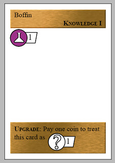
The Boffin steampunky 1900s card
It would be nice if this was a bit more steampunky, with cogs and leather and copper tubes, but I have to admit my limitations and keep it simple.
Next up are the modern day cards, around 2000s technology. Again, I've tried to keep this simple, I've a clean, modern webpage design in my head as the guideline:

The webpage-themed Consumerism card
The latest version, yet to make it into physical form also includes some border art for the futuristic 2100s cards. This is the weakest of the three to my mind, but hopefully feels vaguely futuristic!
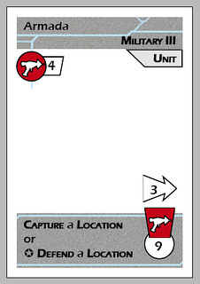
A futuristic Armada card
So, you can see why I wanted an artist a few weeks ago - this is not my strong suit! But hopefully, this basic graphic design/border art gives a flavour of the three ages of cards.
I'm also trying to streamline the game a bit with this new version. One of the things that has been in the game for at least six months is that you have to pay upkeep on population above and beyond the basic population that a location comes with when you acquire it. At the end of every turn, you had to pay some coins if you'd settled extra population on any of your location cards. Despite this having been in the rules for ages, and having personally designed the game this was something I kept forgetting to do, let alone my poor playtesters, who also have to cope with a new set of rules and cards every time they play. I've taken it out in this version, in favour of limiting the number of cards you can settle on a location - I figure it's easier to remember a restriction on things you can do at the point you do them, then remember a little thing at the end of every turn for the rest of the game!
In other news, Mal suggested in the comments of the artists post that I approach the design school at the local uni to see if they'd be interested in offering the graphics design of Codename: Vacuum as a degree project. I think it's an excellent idea, now I just need to pull my finger out and get in contact!


2 comments:
I love the clean/simple card design. Keep it up.
Hiya,
Thanks! I think it needs more detail and tighter themed art to tie everything together, but this will do for now.
Cheers,
Jack
Post a Comment